Roadtrippers Trip Planner Enhancements
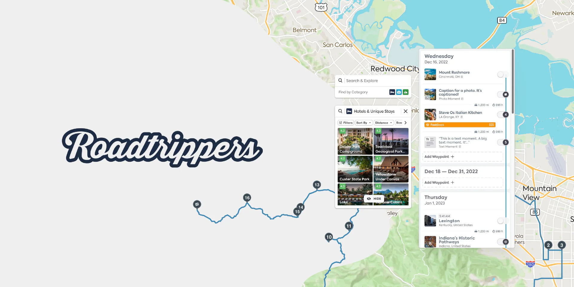
Overview
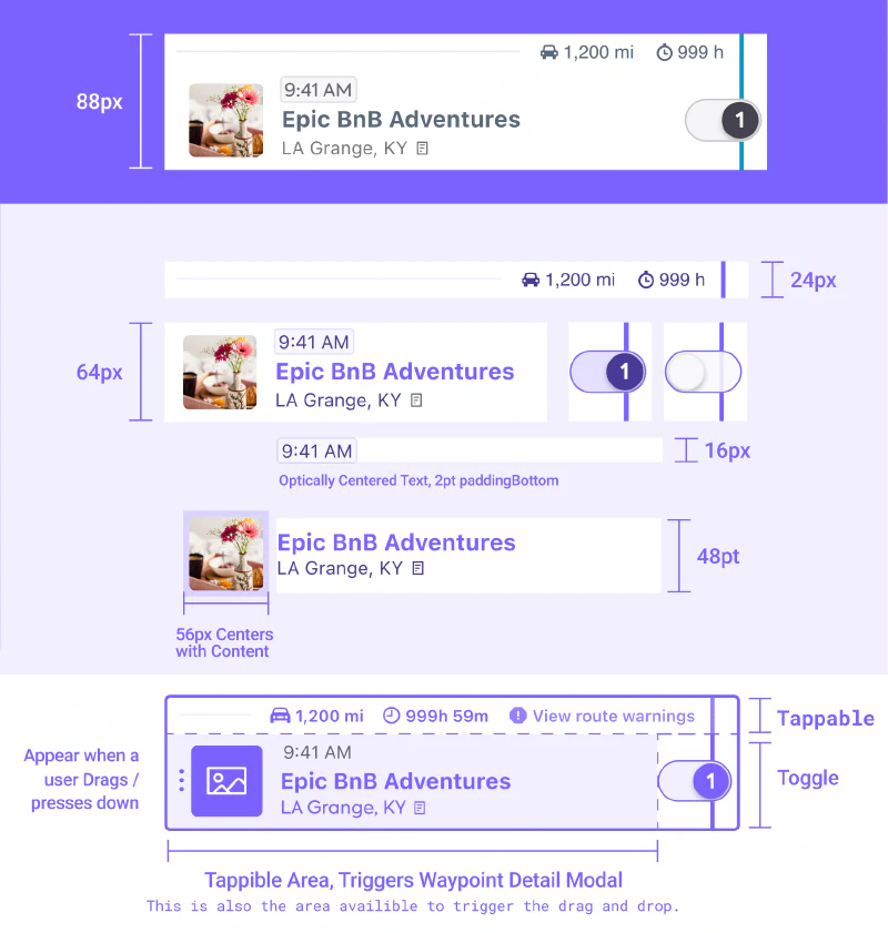
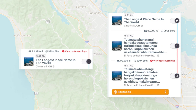
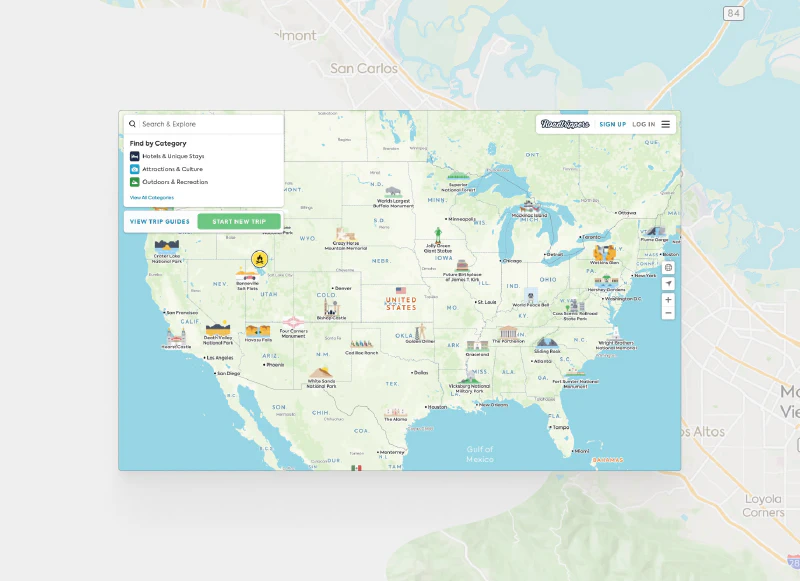
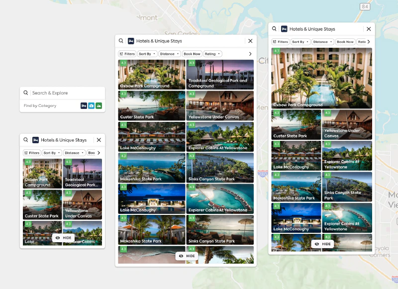
Project Teton was a comprehensive redesign of the Roadtrippers trip planner platform, focusing on enhancing the experience for power users—those who plan long, detailed road trips. As the lead designer, I collaborated with the Director of Product, two PMs, and another Sr. Designer to transform the platform’s core functionality and visual system. The project’s scope included creating a modular trip planner, improving search and filter capabilities, and developing a future-proof color system that would serve as the foundation for the Bonfire Design System.
Challenge
The existing Roadtrippers platform faced several critical issues that needed addressing:
- Power users lacked advanced functionality for planning detailed, multi-leg journeys
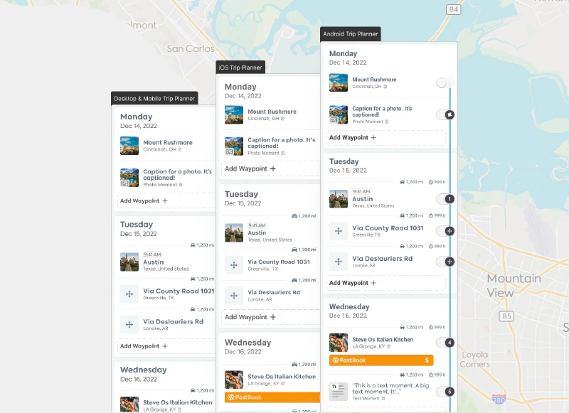
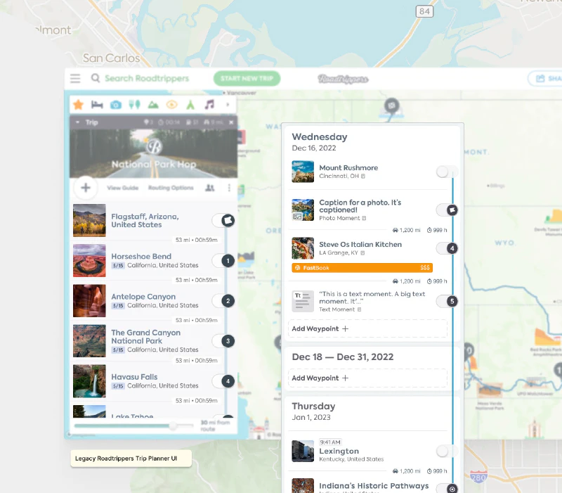
- Users couldn’t effectively segment itineraries by day, making long trip planning cumbersome
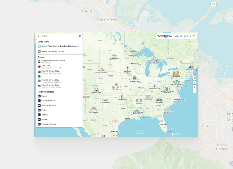
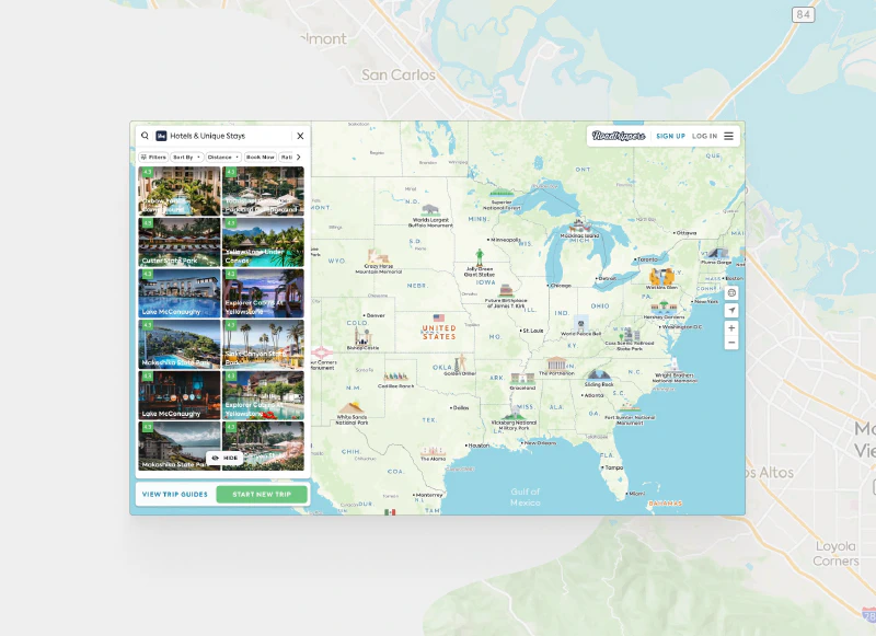
- Search and filter tools were inefficient, limiting detailed trip planning capabilities
- New user onboarding created friction due to a difficult-to-navigate interface
- The color scheme was inconsistent and didn’t meet accessibility standards
- The platform needed to maintain consistency across iOS, Android, and Web platforms
- The route line needed to remain on the right-hand side as part of brand identity
- Updates needed to be shipped in phases while maintaining functionality
Solution
The solution was implemented through several key initiatives:
Modular Trip Planner Development
- Created hundreds of prototypes focusing on critical UI details
- Built interface to handle future features like daily trip segmentation
- Designed robust, modular components for easy developer implementation
Color System Overhaul
- Conducted comprehensive color audit across all platforms
- Developed five distinct color ladders meeting accessibility standards
- Ensured 4.5:1 contrast ratio between lightest and darkest tones
- Created semantic and intentional color system foundation for dark mode
Cross-Platform Consistency
- Standardized UI components across iOS, Android, and Web
- Implemented consistent typography while maintaining platform-specific requirements
- Developed flexible baseline grid system for cross-platform compatibility
Impact
The redesign delivered significant improvements to the Roadtrippers platform:
Technical Achievements
- Successfully implemented an accessible color system meeting WCAG guidelines
- Created modular components that simplified feature integration
- Established cross-platform typography system maintaining baseline grid consistency
User Experience Improvements
- Enhanced trip planning flexibility for power users
- 20% increase in multi-leg trip planning
- 30% increase in the number of trips planned by power users
- Improved search and filter functionality
- Maintained platform consistency across all devices
Future-Proofing
- Set foundation for future dark mode implementation
- Established groundwork for the Bonfire Design System
- Created scalable architecture for future feature additions
The project successfully positioned Roadtrippers as a more reliable and intuitive “copilot” for travelers while establishing a strong foundation for future platform enhancements.
Project Gallery
